
Today, TransitMatters is releasing a new, totally overhauled version of our Data Dashboard.
Since its founding, TransitMatters has focused on helping Greater Boston advocate for the safe, frequent, and reliable transit that it deserves. Boston is fortunate to have passionate and tireless journalists, elected officials, and advocates working to advance these outcomes, and TransitMatters is evolving to fill an essential niche in this policy-making ecosystem: data.
We can only advocate for what we understand, and our volunteers have begun to monitor, analyze, and visualize data so policymakers, riders, and other transit enthusiasts can advocate for a better transit network.
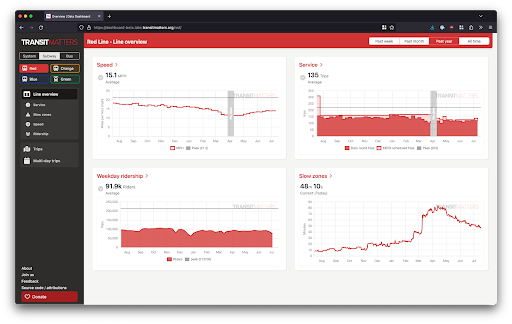
Key Metrics for Transit
There are many ways to measure service quality, and TransitMatters has explored several of them. Some have landed in the Boston Globe, and others have gotten traction on social media. The new dashboard makes it easier to explore some key metrics.
Service on the Blue Line deteriorated after system-wide speed restrictions were imposed on March 10. Total round trips went from 97% of scheduled to 80%.
Service: How much service is the T providing? This is measured in daily vehicle trips, or the number of times a train or bus makes the complete round trip with passengers. More service means shorter wait times, fewer crowded cars, and faster travel times overall.

Average speed on the Green Line peaked in May 2020. This was likely caused by reduced car traffic. Transit Signal Priority (TSP) projects could create similar speed improvements in the long term.
Speed: How quickly can riders move through Boston? This is presented as a monthly average in miles per hour. It’s calculated across the entire line, in both directions, including dwell times.

The T promised that the Orange Line would be faster after the Orange Line shutdown. But today, there are almost 15 minutes of delay.
Slow Zones: How much additional time should riders allow their trip to take? This is measured as the additional minutes and seconds it takes a vehicle to complete an end-to-end trip compared to historical averages. These delays are mostly caused by slow zones.

Ridership across the system dropped dramatically after WHO declared COVID-19 a pandemic. Ridership on the Red Line has steadily increased and is currently about 40% of the peak.
Ridership: How are riders responding to the experience offered by the T? This is measured in one-way trips (every time a passenger taps their fare card), and presented as daily totals.
These are crucial and high-level indicators of system health, and this new view provides them all at a glance: casual visitors don’t need to know what they’re looking for. And clicking on the name of each top-level metric chart leads to more data on the same theme.

Detailed information on Slow Zones in the new Data Dashboard.
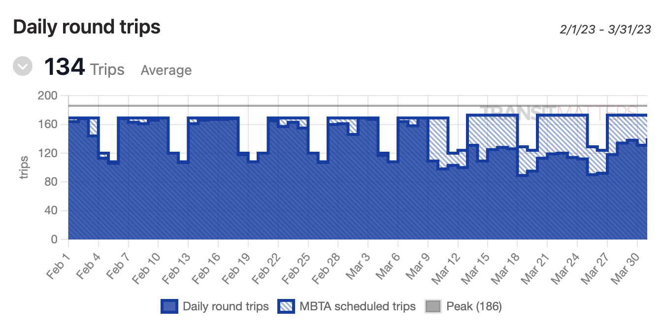
If you want to deep-dive into historical data, the dashboard has you covered, too. Maybe you want to better understand how a specific derailment affected headways for the rest of the day. You might be curious if the wider doors on the new Orange Line trains improved dwell times. Or perhaps you noticed that your commute on the Red Line has gotten slower, and you want to find out when that started. You can still select a pair of stations and get all this data — for a single day, or a whole year.

Pick a historical day or date range to view detailed performance data.
We have big plans for the future of the Data Dashboard. Over time we plan to add up-to-the-minute system status, metrics for on-time performance and vehicle bunching, and more data about bus and Commuter Rail service—also, flexible interfaces for power users to go deeper into the data we already have. The Dashboard will be a unified home for all of it, and we’re excited to see it evolve alongside Boston’s transit network in the coming months, years, and decades.
Eight Minutes to Park Street
The first section of our subway system opened in 1897. What we have, we have inherited. It cannot be an easy task for the MBTA to keep a century’s worth of history and know-how in mind as it operates, modernizes, and expands the system. There are now several generations’ worth of maps, schematics, and timetables to be referenced — layer upon layer of their hopes and frustrations and sparks of brilliance if you know how to look. But for all that we have, much more has likely been lost. Our memory of transit past is imperfect and leaky. (Can you blame us? We have places to be.)

A photo of Harvard Square subway station advertising “8 Minutes to Park St.” (source, Lynch, Kevin; Kepes, Gyorgy; Bichajian, Nishan, released under CC-BY-NA 3.0).
Today’s Red Line riders might find the photo above surprising. In the mid-1950s, a trip from Harvard to Park Street appeared to take eight minutes. Today it takes 50% longer than that. If we want to hold our transit system to a standard we know can be achieved, we need a detailed record of what used to be possible. And, fundamentally, that’s what the Data Dashboard is for. We’re building this for the transit riders of today, but also for the 2030s, 2040s, and beyond. Of course, we hope that they’ll be enjoying a more expansive and functional system. But as likely as not, they’ll find echoes of their problems in the ones we’re facing now.

A screenshot of our Data Dashboard, shows a nearly 13-minute travel time for the same trip on a typical Wednesday.
We hope that you’ll check out the new Data Dashboard, and share your insights from it with your friends, your neighbors, and on social media. We would love any feedback on what else you’d like to be able to do with this tool (or what’s just not working) via social media or using this form. And if you want to support our efforts to tell the story of transit in Boston for decades to come, please consider supporting our work by becoming a member.